Finding your wedding style can feel like scrolling through an endless mood feed — beautiful, but overwhelming. The good news: once you land on a clear visual direction, everything else starts to fall into place. Your invitations, florals, tableware, signage — it all connects through one coherent language.
A well-built moodboard is that anchor. Here's how to create one that actually works.
Why Your Wedding Style Needs a Starting Point
Most couples don't start with a style — they start with feelings. You love the warmth of golden-hour light. You're drawn to clean, airy spaces. Or maybe you keep saving images of deep jewel tones and candlelit tables. Those instincts are already pointing somewhere.
In 2026, three broad aesthetics continue to resonate with couples planning across Europe and beyond:
- Boho — textured, earthy, layered. Think dried pampas, terracotta vessels, natural linen.
- Minimal — intentional and calm. Neutral palettes, clean typography, plenty of negative space.
- Vintage — nostalgic and rich. Antique details, deep florals, warm candlelight.
None of these are rigid boxes. Many weddings blend elements — a minimal venue with vintage tableware, or boho florals in a clean outdoor setting. But having a primary direction makes every decision easier.
The Role of a Color Palette (with Real Hex Codes)
A color palette isn't just an aesthetic choice — it's a planning tool. When you define 4–5 core colors early on, they guide your florist, your stationer, your venue stylist, and even the clothing choices for your wedding party.
Here are three starting palettes as reference:
Boho
- Terracotta
#C4663A - Dusty Rose
#D4A5A5 - Sage Green
#8A9E85 - Warm Sand
#E8D5B0
Minimal
- Soft White
#F5F0EB - Warm Taupe
#C8B9A8 - Slate
#8A9BAE - Blush
#E8C5C0
Vintage
- Dusty Mauve
#B8809A - Champagne
#E8D5A3 - Ivory
#F5F0E0 - Deep Burgundy
#7D2D3F
Using actual hex codes when communicating with vendors removes ambiguity. "Dusty rose" means something different to ten different florists. A hex code doesn't.
Font Pairings: The Detail That Changes Everything
Fonts carry mood just as much as color. The right pairing — one display font, one body font — makes your Save-the-Date feel cohesive with your menu cards and your wedding website.
| Style | Display Font | Body Font |
|---|---|---|
| Boho | Playfair Display | Lato |
| Minimal | Cormorant Garamond | Montserrat |
| Vintage | Libre Baskerville | Raleway |
All three examples are available free on Google Fonts, which means your designer, your stationer, and you can all access them without friction.
5 Steps to Build Your Own Wedding Moodboard
1. Collect without filtering
Spend a week saving images that attract you — no judgment, no system yet. Pinterest, Instagram, real wedding blogs, interior design accounts. Include photos that aren't weddings at all: a restaurant you love, a piece of furniture, a landscape. Visual instincts often cross categories.
2. Look for patterns
After a week, lay everything out and look for what repeats. Are most images light and airy, or dark and moody? Do you keep saving dried flowers or lush greenery? Structure or organic shapes? This is where your style starts to reveal itself naturally.
3. Narrow to a palette
Choose 4–5 colors that appear most often across your saved images. Use a tool like Coolors or Adobe Color to refine them — and note the hex codes. This becomes your anchor for every decision that follows.
4. Add your font pairing
Based on your primary style direction, choose a display font and a body font. Test them together on a simple mockup — even a basic Canva document is enough to feel whether the combination works. Trust your gut here.
5. Apply to one touchpoint first
Before rolling your style out across everything, apply it to a single element: your Save-the-Date or your wedding website header. This gives you a real-world test. If it feels right, you're on track. If something feels off, it's still easy to adjust.
From Save-the-Date to Table Decor: How It All Connects
Once your palette and fonts are defined, consistency becomes surprisingly simple. Here's how the style flows through a full wedding:
- Save-the-Date — first impression; sets the visual tone
- Invitations — same palette, more formal detail
- Wedding website — font pairing, colors, and mood imagery in one place
- Ceremony signage — physical translation of your typographic choices
- Florals — brief your florist with your hex codes and mood images
- Table decor — linens, ceramics, candles: all guided by your palette
- Menu cards and place settings — the typography moment guests hold in their hands
When these elements share the same visual language, your wedding feels considered and calm — not by accident, but because of the groundwork you laid early.
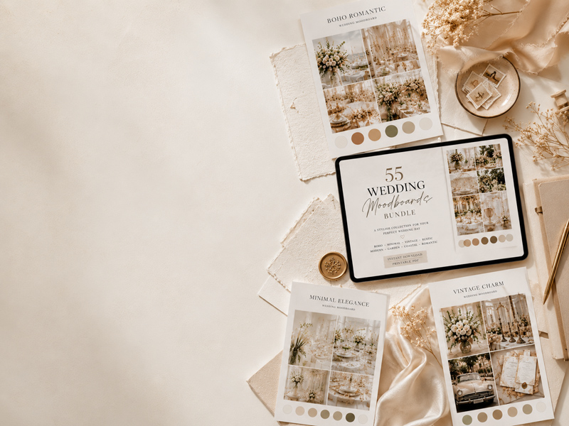
A Shortcut Worth Knowing
If you'd rather start with something ready-made before building from scratch, the 55 Wedding Moodboard Bundle offers curated style directions with coordinated color palettes, font suggestions, and mood visuals across dozens of aesthetics. It's a useful way to browse and compare directions before committing to one.
It won't make decisions for you — but it can make the starting point much clearer.
Your wedding style doesn't have to be found all at once. Give yourself time to collect, notice what draws you in, and build from there. A clear palette and a well-built moodboard won't just help you — they'll make every conversation with every vendor smoother, too.
Want a head start on your style?
Start planning your day in WeddingFlow — then explore the full bundle of 55 curated moodboards on Etsy, each with its own color palette, hex codes and font pairings.
Get the free PDF + planning tips
Enter your email — we'll start the download and add you to our wedding planning newsletter.
By submitting, you'll receive the PDF and our wedding planning newsletter. No spam, unsubscribe anytime.
Thanks! Your download has started — and you're on the list.
Something went wrong. Please try again.